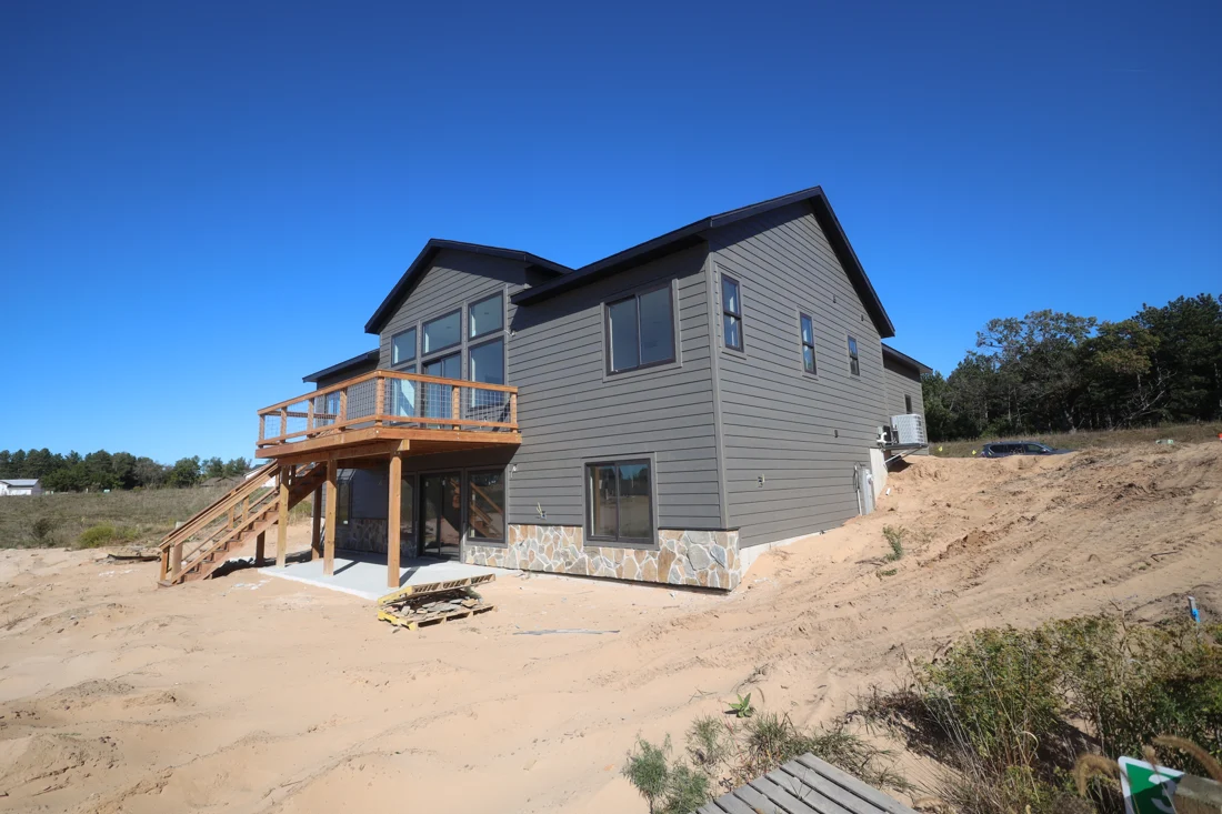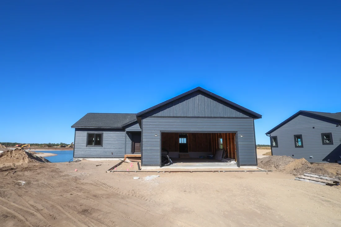

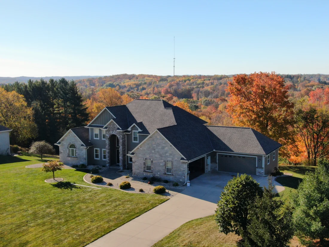
A new siding color rarely starts with a blank canvas. The roof, masonry, windows and neighboring surfaces are already part of the composition. If those elements are staying, they should guide the palette before you fall in love with a color on someone else’s home.
This is especially useful when the roof contains several tones. From close up, you may see flecks of gray, brown or charcoal. From the street, the roof reads as a broader field of color. Both views matter, but the distant view often better reflects how the completed exterior will be experienced.
Start with the permanent elements
Make a list of what will remain through the siding project. Include the roof, brick or stone, window frames, garage doors and visible foundation. Photograph each, then take a wider image showing how they relate. Do not assume a roof that you describe as gray is visually neutral beside every siding sample.
Choose one of these retained elements as your anchor. Usually this is a large surface or a feature that would be difficult to change. The goal is not to match it exactly. It is to find siding and trim colors that form an intentional relationship with it.
Test a small set of palettes
Create two or three combinations rather than collecting dozens of unrelated colors. Each combination should name a main siding color, a trim approach and any limited accent. Compare a low-contrast scheme with a more defined one so you can see what each does to the building’s proportions.
A darker trim can make some openings more prominent, while a similar trim and siding color can create a quieter composition. Those effects depend on the house and the amount of trim involved. Mark the proposed colors on a photograph before treating a small sample board as the whole design.
Look outdoors at different times
Put physical samples beside the retained materials. Review them in sun and shade, and return later in the day if possible. Notice which combination still looks coherent when the light changes. If two options are close, photograph your notes rather than relying on memory after the samples are put away.
Avoid making the decision from a phone image alone. Screen brightness, camera processing and surrounding colors can all influence the impression. Use digital images to organize choices, and use actual samples to approve the material and finish.
Decide what deserves emphasis
An entry door, porch or distinct building volume can be a useful focal point. Ask whether your proposed contrast supports that focal point or competes with it. Not every corner, gutter and trim board needs to become a separate visual feature.
Before ordering, document each color with its product and location on the building. Confirm any community or project approval requirements that apply to your property. Tell Tremor about your siding project and identify the roof and other materials you plan to retain. A convincing palette should make the existing pieces feel connected, while giving the new work a clear and considered role.
Bring your project into focus.
Tremor is based in Fall River and Kenosha, with work across Wisconsin. Share your location and the exterior work you have in mind.
Start a conversation